Add paste-style clip cards - #96
Open
alvst wants to merge 1 commit into
Open
Conversation


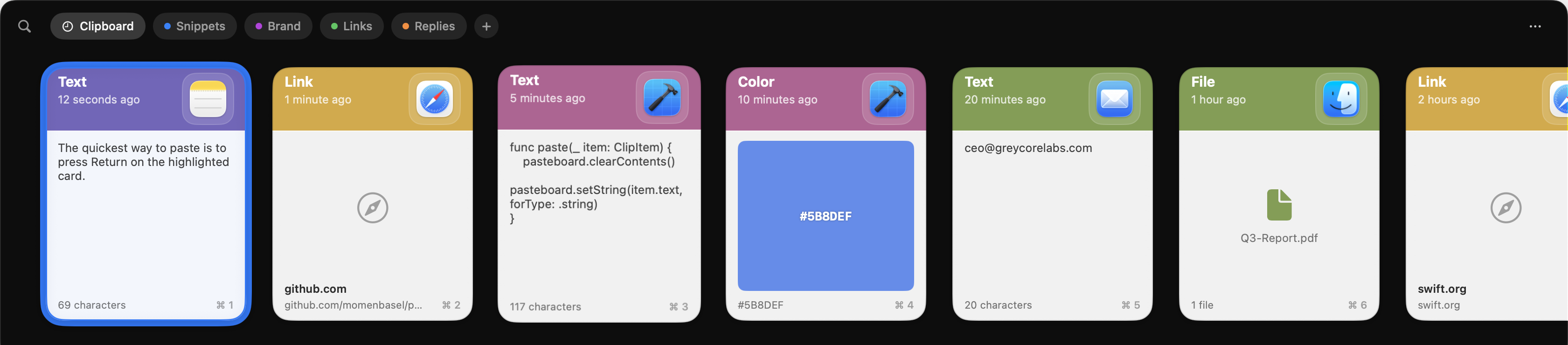
Cards spend their space on chrome instead of on the clip. The header
is a 68pt band with a small icon boxed in a tile, and an image clip -
the one kind of card you identify purely by looking - is squeezed into
whatever the padding leaves behind.

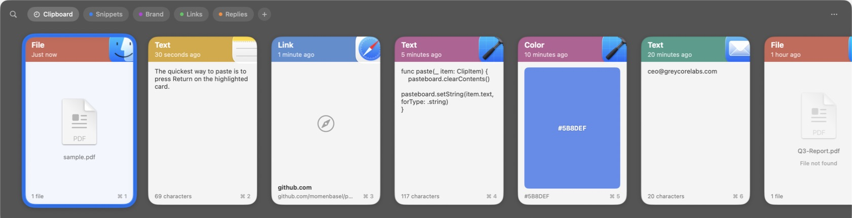
Behind the new "Paste-style clip cards" toggle, the header shrinks to
50pt and the source app's icon is scaled past the card's top-right
corner, cropped by the card's own rounded rectangle so it frames the
corner rather than sitting inside a tile. The header is sized around
the icon rather than the icon blown up to fill the header, because
scaling artwork past its natural size is what makes it look soft. The
icon is drawn from artwork trimmed to its opaque bounds: macOS app
icons carry a transparent margin about 10% wide, so aligning the raw
image to the corner would leave a gap the size of that padding.

Image clips - and file clips that point at an image, which is how a
copied screenshot actually arrives - now run edge to edge, over a
transparency checkerboard so a cut-out is distinguishable from white.
The card body's padding moved onto the content and footer so the image
can reach the card edges while the footer keeps its inset. Whether a
file clip is an image is decided from its path extension, never by
opening it: that runs on every render.

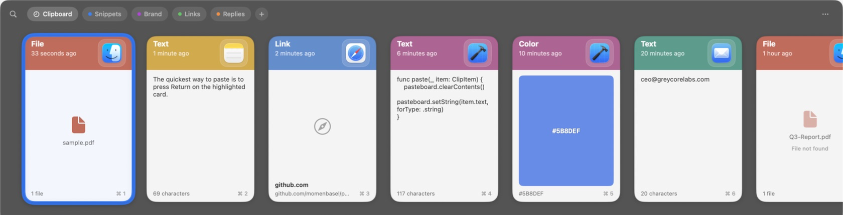
File clips with no preview get the same treatment. The 32pt generic
"doc.fill" glyph becomes the file's real Finder icon at 104pt, because
that badge is the whole identity of a document you can't see into; a
clip with no usable file URL still falls back to the glyph. A clip of
several files fans out the real icons of its first three, first on
top, which says both what kind of files these are and that there is
more than one - something a single page icon cannot. Its header reads
"5 files" rather than the generic type label, since a multi-file clip
is one clip of many files and naming only the first hid the rest.

A file that does have a preview shows it. Every PDF, model, and
document otherwise looked alike, so a single non-image file now
renders the system's Quick Look thumbnail of its real contents,
generated once per path and cached - along with the paths the system
has no preview for, so a file it cannot render is not asked about
again on the next card that shows it. Generation runs in a task keyed
on the clip rather than on the render pass, so scrolling the strip
starts no work of its own.

A clip whose file has moved or been deleted dims its icon and says
"File not found", and draws that icon from the file's type rather than
its path: asking the workspace about a path that no longer exists
hands back a blank page, which reads as a failed render. This is the
one thing here that is not behind the toggle. It reports a fact about
the clip rather than restyling it, and a clip that can no longer paste
anything should say so in either layout.

The toggle defaults on; turning it off restores the tile header, the
inset image, and the generic file glyph exactly as before - save for
that missing-file caption, which is information rather than style.

This file contains hidden or bidirectional Unicode text that may be interpreted or compiled differently than what appears below. To review, open the file in an editor that reveals hidden Unicode characters.
Learn more about bidirectional Unicode characters
Sign up for free
to join this conversation on GitHub.
Already have an account?
Sign in to comment
1 participant

Add this suggestion to a batch that can be applied as a single commit.This suggestion is invalid because no changes were made to the code.Suggestions cannot be applied while the pull request is closed.Suggestions cannot be applied while viewing a subset of changes.Only one suggestion per line can be applied in a batch.Add this suggestion to a batch that can be applied as a single commit.Applying suggestions on deleted lines is not supported.You must change the existing code in this line in order to create a valid suggestion.Outdated suggestions cannot be applied.This suggestion has been applied or marked resolved.Suggestions cannot be applied from pending reviews.Suggestions cannot be applied on multi-line comments.Suggestions cannot be applied while the pull request is queued to merge.Suggestion cannot be applied right now. Please check back later.
Cards currently spend their space on chrome rather than on the clip: a 68pt header with a small icon in a tile, and an image — the one card type you identify purely by looking — squeezed into whatever the padding leaves. This adds an alternative card style behind a setting.
What changed
doc.fillglyph; a multi-file clip fans out the real icons of its first three, first on top. A clip with no usable file URL still falls back to the glyph.Screenshots
Before:
After:
Notes for review
alvie/pr-25-clip-card-metadata; the two deliberately use differently-named helpers, so either can merge first.This feature should be bundled into v2.
Part of #80.